1. White space
Use padding to add gaps and white space, reflecting a sense of high-level ~ Combined with Flutter's hot reload, you can quickly experiment to find the right padding.
2. Typography
Changing to a nice font can also make the app look very advanced. GoogleFont cooperates with hot reload to choose good fonts
3. Color
Add a special color to the app.
You can find some color palettes from the Internet, such as:
https://coolors.co/palettes/trending
https://undesign.learn.uno/colors/
4. Iconography
It means to encourage adding more pictures/icons to the app. Filip's example uses BoxDecoration (you can configure gradient and image): https://github.com/filiph/little_things/blob/main/lib/src/list.dart#L18-L32
Container(
  decoration: BoxDecoration(
    gradient: LinearGradient(
      colors: [
        Color(0xFF96E3FF),
        Color(0xFF9EECFF),
        Color(0xFF9FEBFF),
        Color(0xFF9FEEFF),
        Color(0xFF9FECFF),
      ],
    ),
    image: DecorationImage(
      image: AssetImage('assets/meditation.jpg'),
      alignment: Alignment.bottomCenter,
    ),
  ),
  child: Scaffold(/*...*/),
)
5. Animation

Animation can also greatly improve the user's evaluation of the app. The default animation curve is linear, which generally makes people feel unnatural. You can try easeIn/easeOut.
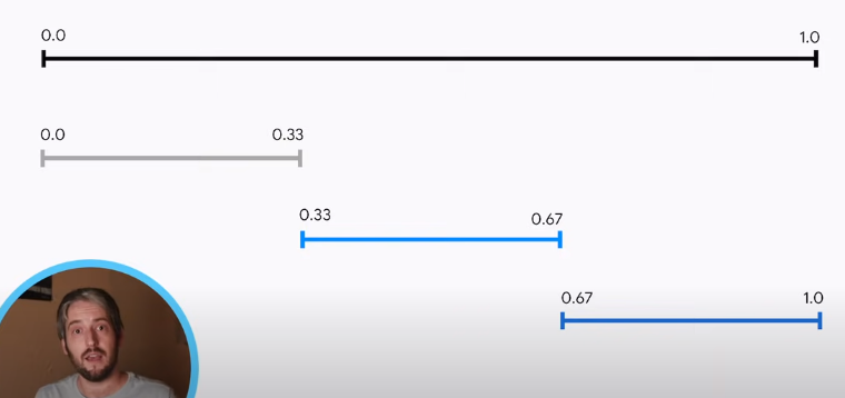
In addition, multiple animations (slideTransition / resize / text, etc.) can be provided at the same time. At this time, if all animations run together, it will be very messy.
We should use "Staggered Animation", which is one animation followed by another animation. Using curve: Interval(0.2, 0.6), you can make this animation run for 20%~60% of the time of the entire animation(parent):
ScaleTransition(
  scale: CurvedAnimation(
    curve: Interval(
      0.2,
      0.6,
      curve: Curves.elasticOut,
    ),
    parent: _controller,
  ),
  child: /*...*/,
)
See the end result