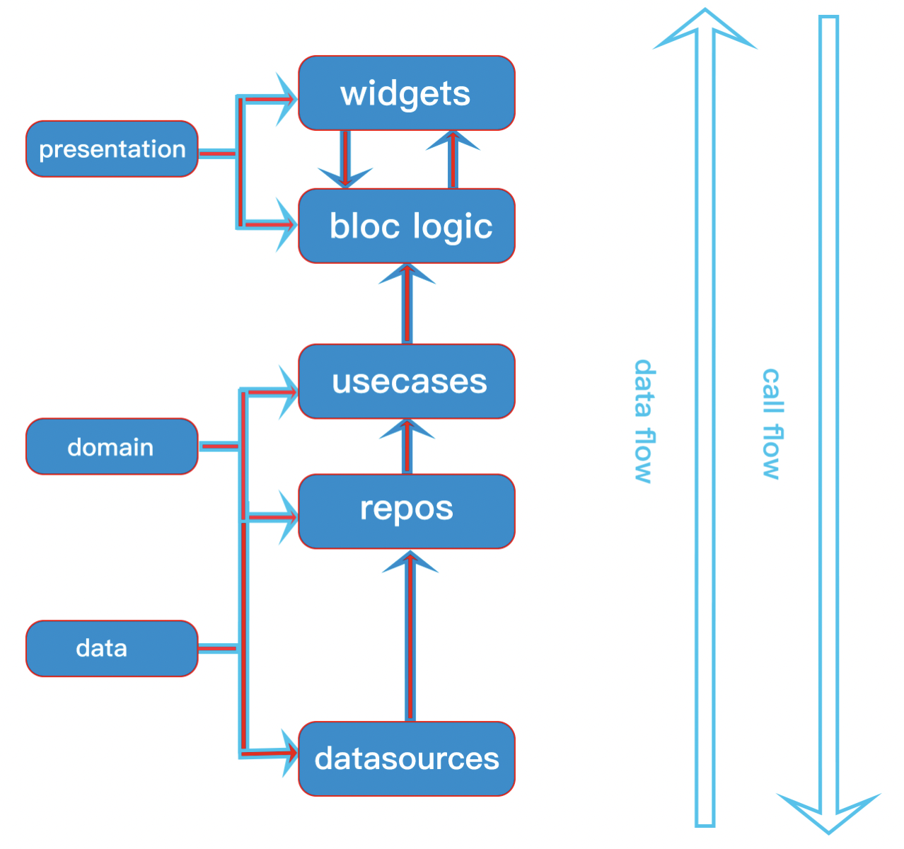
Here we will focus on making dynamic resuable custom app bar for your flutter application. This app bar example will be based on the previous part flutter custom painter
In this custom design we will make three things dynamic
Our CustomAppBar class is Stateless class and it extends PreferredSizeWidget class. Because of this we would be able to do custom height and width of our app bar.
So we needed to override preferredSize getter.
  @override
  Size get preferredSize => const Size(
    double.maxFinite,
    80,
  );
Our title for app bar will have default value. If you don't pass a value to app would still work. That's why in CustomAppBar class constructor we defined
this.title = '',At the same time our other declared value looks like this. As you can see all the parameters in the constructor is optional named parameters.
That means, even if you don't pass any values to them, the app bar would still work.
 const CustomAppBar({
    Key? key,
    this.title = '',
    this.leading,
    this.titleWidget,
    this.showActionIcon = false,
    this.onMenuActionTap,
  }) : super(key: key);

  final String title;
  final Widget? leading;
  final Widget? titleWidget;
  final bool showActionIcon;
  final VoidCallback? onMenuActionTap;
Since the values are all optional, that means either we have to use default values for them or check if the values are null or not.
The build method looks like below
@override
  Widget build(BuildContext context) {
    return SafeArea(
        child: Padding(
            padding: const EdgeInsets.symmetric(
                horizontal: 25,
                vertical: 25 / 2.5),
          child: Stack(
            children: [
              Positioned.fill(
                child: titleWidget == null ?
                Center(child: Text(title, style: TextStyle(
                    fontWeight: FontWeight.bold, fontSize: 16, color: Colors.white)))
                    : Center(child: titleWidget!),
              ),
              Row(
                mainAxisAlignment: MainAxisAlignment.spaceBetween,
                crossAxisAlignment: CrossAxisAlignment.center,
                children: [
                  leading ??
                      Transform.translate(
                          offset: const Offset(-14, 0),
                          child:
                          const BackButton()),
                  if (showActionIcon)
                    Transform.translate(
                      offset: const Offset(10,
                          0), // transform to allign icons with body content =>  - CircularButton.padding
                      child:  InkWell(
                          onTap: onMenuActionTap,
                          child: Padding(
                            padding: const EdgeInsets.all(10.0),
                            child: Icon(Icons.menu, color:Colors.white),
                          )),
                    )
                ],
              )
            ],
          ),
        )
    );
  }
In build method, we check if leading or titleWidget is not null or not.
If null, then we fall back to defualt condition. The widgets leading and titleWidget could be any kind of widgets in fluttter. These two widgets make the app bar more reusable.